What’s in a Name?
 Mon, July 4, 2016
Bike racing in the UK and the rest of Europe was always traditionally a working class sport, certainly up until the 1950s.
Working class people, for example your average factory worker would use a bicycle as transport to and from work each day.
It was natural that some of them would be into bike racing. Frames for racing bikes were often built by a local framebuilder. Many of these framebuilders were ex bike racers themselves. Well-known personalities who put their first and last name on the frames they built.
Names like Bob Jackson, Harry Quinn, and Freddie Grubb. Notice the first names were always abbreviated in true working class tradition. The name on the frames did not read Robert Jackson, Harold Quinn, or Frederick Grubb, that would have been far too grandiose for their working class customers to relate.
So quite naturally I followed suit when I started building frames and put ‘dave moulton’ on the frame, all in lower case letters which made it somewhat distinctive. Being working class myself, I was always known as “Dave.” Only my mother called me David.
I came to the US in 1979, and two years later in 1981 I was in Southern California, building frames under my own name again. I was essentially starting over again from scratch. The general populous did not have a clue who Dave Moulton was, only a handful of people in the bike business knew of my work.
There was an immediate resistance to the name. I got comments like, “Why do you put your first and last name on there, people will think it is my name.” “My name,” meaning of course the customer. “Not exotic sounding enough,” was another comment I heard all the time.
I even had requests to build frames without my name on it. I stood my ground there, and refused those orders, and in a relatively short time my reputation as a framebuilder grew, and the resistance to the name disappeared.
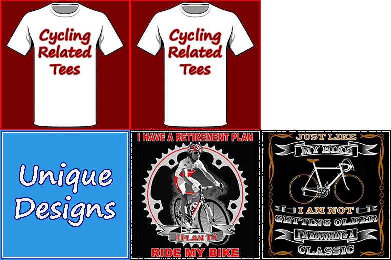
However, I was reminded of this just last week. For this last year I have been designing cycling related tee shirts. I found bike tees are often lacking cleaver design and sometimes quite lame when it comes to any kind of a message. I am trying to come up with interesting and different designs. Conversation pieces if you will.
 So when I recently had a request for my four “m” logo on a shirt. I thought it might be an idea to add something extra to the design.
Although I am a little more well-known in the US than I was back in the 1980s, probably only a fraction of one percent of the general population would have even heard of Dave Moulton, much less be familiar with my logo.
So put a large four “m” logo on a shirt, and occasionally someone will recognize it as Dave Moulton’s logo. Everyone else will not even give it a second look, because to them it is a meaningless symbol. My thought was to combine the logo with a design based on something called a “Celtic Knot.” (See top picture.)
Someone might say to the wearer, “That’s a cool design on your shirt, does it have a meaning?” Which is what I mean by a conversation piece. Others in the know, might give the shirt a second look, then realize, “That’s the Dave Moulton logo in there.”
But when I asked for feedback on the Dave Moulton Bikes Facebook page, the pure fans of my bikes hated it. “Too busy.” And, “Takes away from the simplistic beauty of the original logo.” Were typical comments.
My thoughts were. I’m no longer selling bikes. My logo does not have to jump out and grab you by the throat. It can be a little more subtle. But on the other hand, this is a tee shirt with my logo on it. Who else will it appeal to except fans of my bikes?
Oh well, back to the drawing board.
 Dave Moulton | Comments Off |


Reader Comments (13)
I've had frames made by Mal Rees and Dave Yates but also by Arthur Caygill. Not sure the latter would have put Art or Artie on his frame :-)
I'd agree with the people who like the simplicity of the original logo Dave.
Yoav,
Art or Artie was always an American abbreviation, unless that has changed since I left the UK. I can't think of an English version, except a Londoner would pronounce it "Arfer."
Dave
Well, you have to consider your FB audience, Dave :-)
Like most people, I already have way too many T-shirts. That doesn't stop me from buying them, but it does slow me down. I like to buy shirts as souvenirs - it's better to buy them in person in my experience as sizes vary so much, plus weights, fabric composition and even the neckline affect whether it gets worn or ends up donated or as a polishing cloth..
A really nice T-shirt is almost formal wear in the USA these days.
KISS
Arthur Caygill was a Yorkshireman so definitely not an Art!
I have long liked the logo as you designed it originally -- it's a very simple, cool, and distinctive logo.
Turn the 4 lower case 'm's into a Celtic Knot, without the straight lines...
Hey Dave. Your bloody eighty. Take a vacation (HOLIDAY) enjoy yourself with Kathy life's to short to think about logos. ENJOY!!!!! (while you can mate) I am.
Dick is usually short for Richard bit I've also heard it used for Arthur. Good luck with the T shirt designs.
Serious question Dave - what's the origin of the logo as it stands?
Is it a pseudo wheel? Unlikely cos you built frames, not wheels.
Is there a suggestion of cardinal points or a compass rose with each being 90 degrees rotated?
Perhaps something cyclical - down and round and back up to where it started again?
Or was it a doodle that turned into a logo ?
Criggie,
The logo is four lower case letter 'm' placed north, south, east and west.
Dave
Sorry - I was asking if there was something deeper beyond the four m's
You've mentioned two other Moultons who build bikes, perhaps there's a fourth one you've not yet found ?